[1]:
from multicorner import mcorner
import corner as corner
import numpy as np
Labels, Titles and Fonts
While we try to pick sensible defaults, one might wish to further customize these plots for use in presentations or publications.
[2]:
np.random.seed(42)

# Generate random covariance matrices with sigmas ~ 1
def random_covariance():
    A = np.random.rand(3, 3)
    cov = np.dot(A, A.T)  # Ensure it's positive semi-definite
    return cov
[3]:
mean1 = np.array([0,5,10])  # Random center
cov1 = random_covariance()

# Generate data, trimodal distribution
data1 = np.random.multivariate_normal(mean1, cov1, 5000)
data2 = np.random.multivariate_normal(mean1+100, cov1, 1000)
data3 = np.random.multivariate_normal(mean1+200, cov1, 1000)
data = np.vstack((data1, data2, data3))
Titles
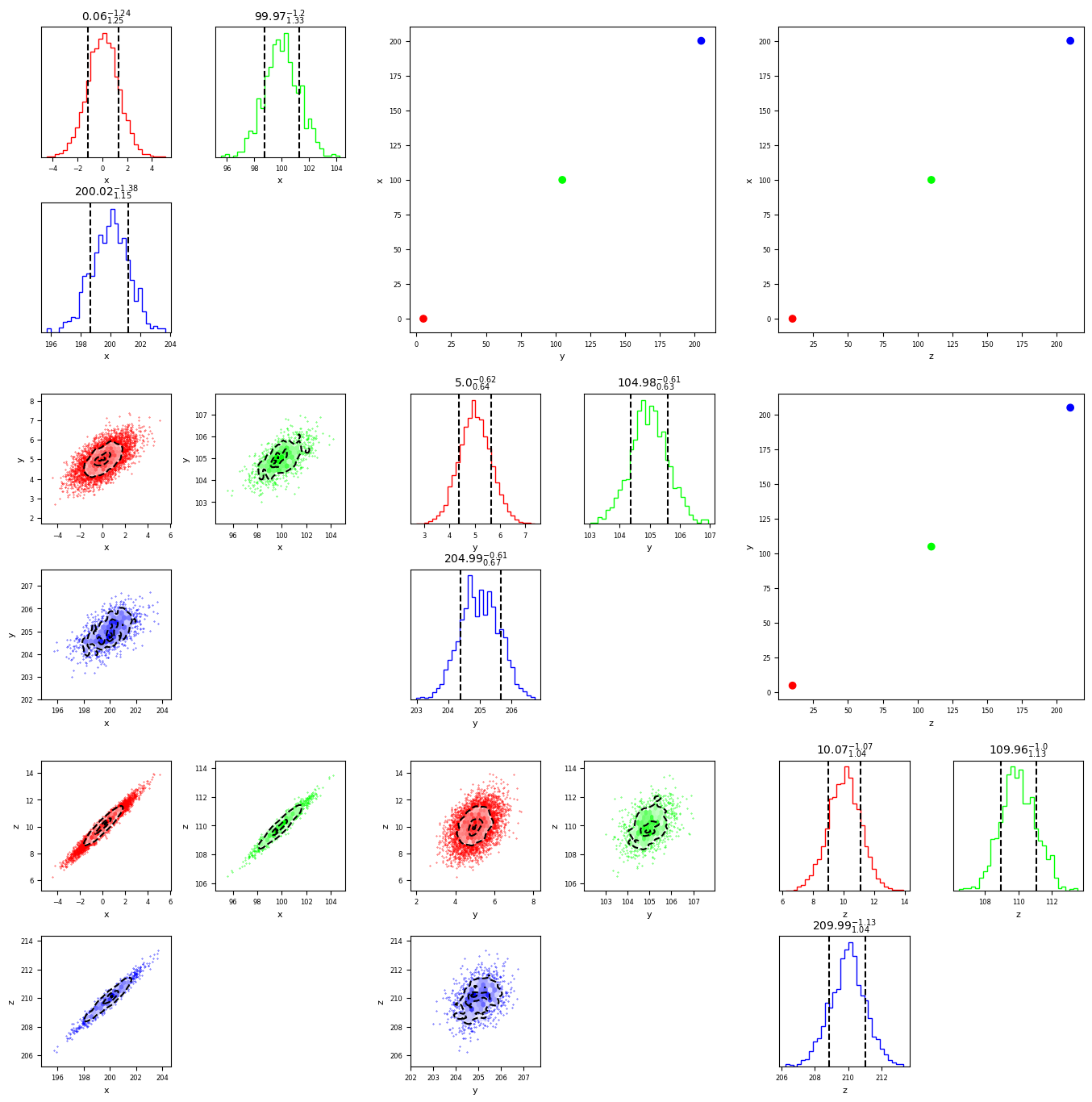
The plot has a total of 3 arguments to control titles. First, the diagonal title can (uniquely) be supplied with the argument ‘percentile’, to automatically compute the chosen percentile bounds of each distribution
[4]:
fig = mcorner(data,labels=['x','y','z'],percentiles=True,diag_title='percentile')
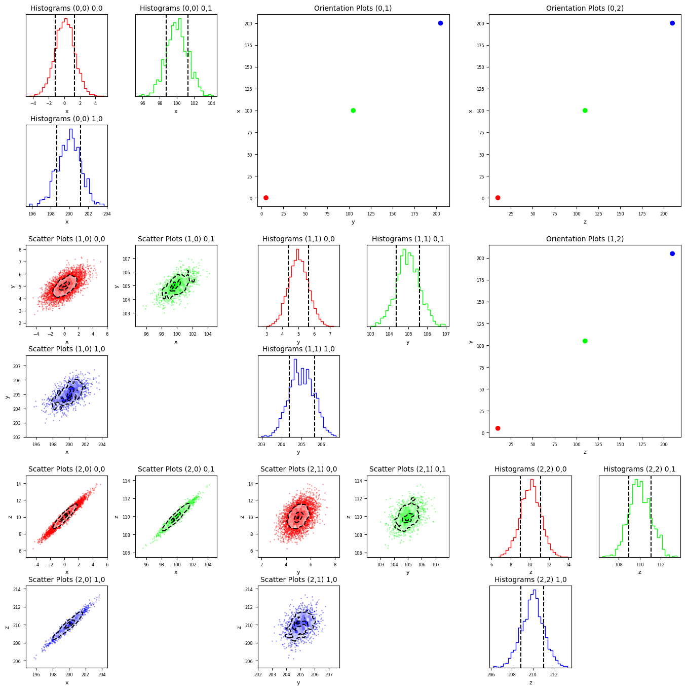
More generally, each title can be supplied with a callable function, which can be used to format each individual title according to user preferences
[5]:
upper_title_func=lambda i,j: f"Orientation Plots ({i},{j})"
diag_title_func=lambda i,j,ii,jj: f"Histograms ({i},{j}) {ii},{jj}"
lower_title_func=lambda i,j,ii,jj: f"Scatter Plots ({i},{j}) {ii},{jj}"
[6]:
fig = mcorner(data,labels=['x','y','z'],percentiles=True,upper_title=upper_title_func,lower_title=lower_title_func,diag_title=diag_title_func)
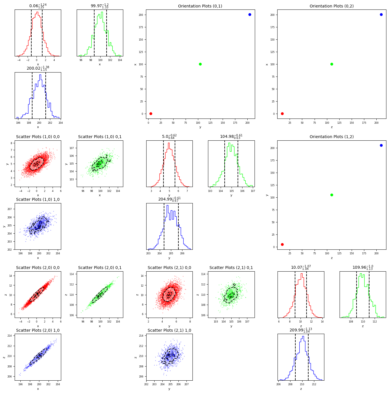
The two arguments can be mixed-and-matched
[7]:
fig = mcorner(data,labels=['x','y','z'],percentiles=True,upper_title=upper_title_func,lower_title=lower_title_func,diag_title='percentile')
The size of the labels, titles, fonts and ticks can be controlled by passing the relevant arguments to the code
[8]:
fig = mcorner(data,labels=['x','y','z'],percentiles=True,upper_title=upper_title_func,lower_title=lower_title_func,diag_title='percentile',
                                  titlesize=16,fontsize=8,labelsize=10,ticksize=8)
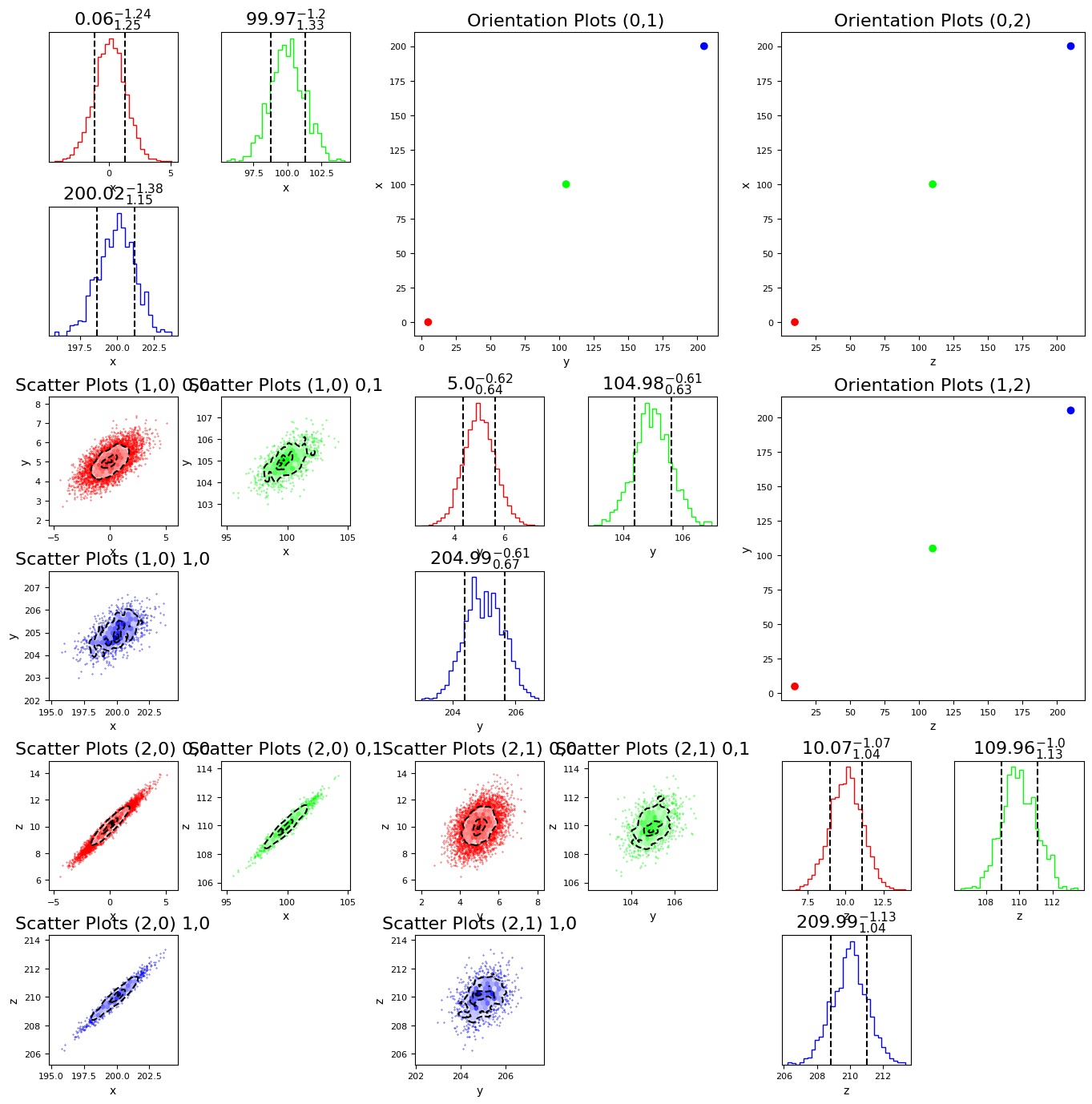
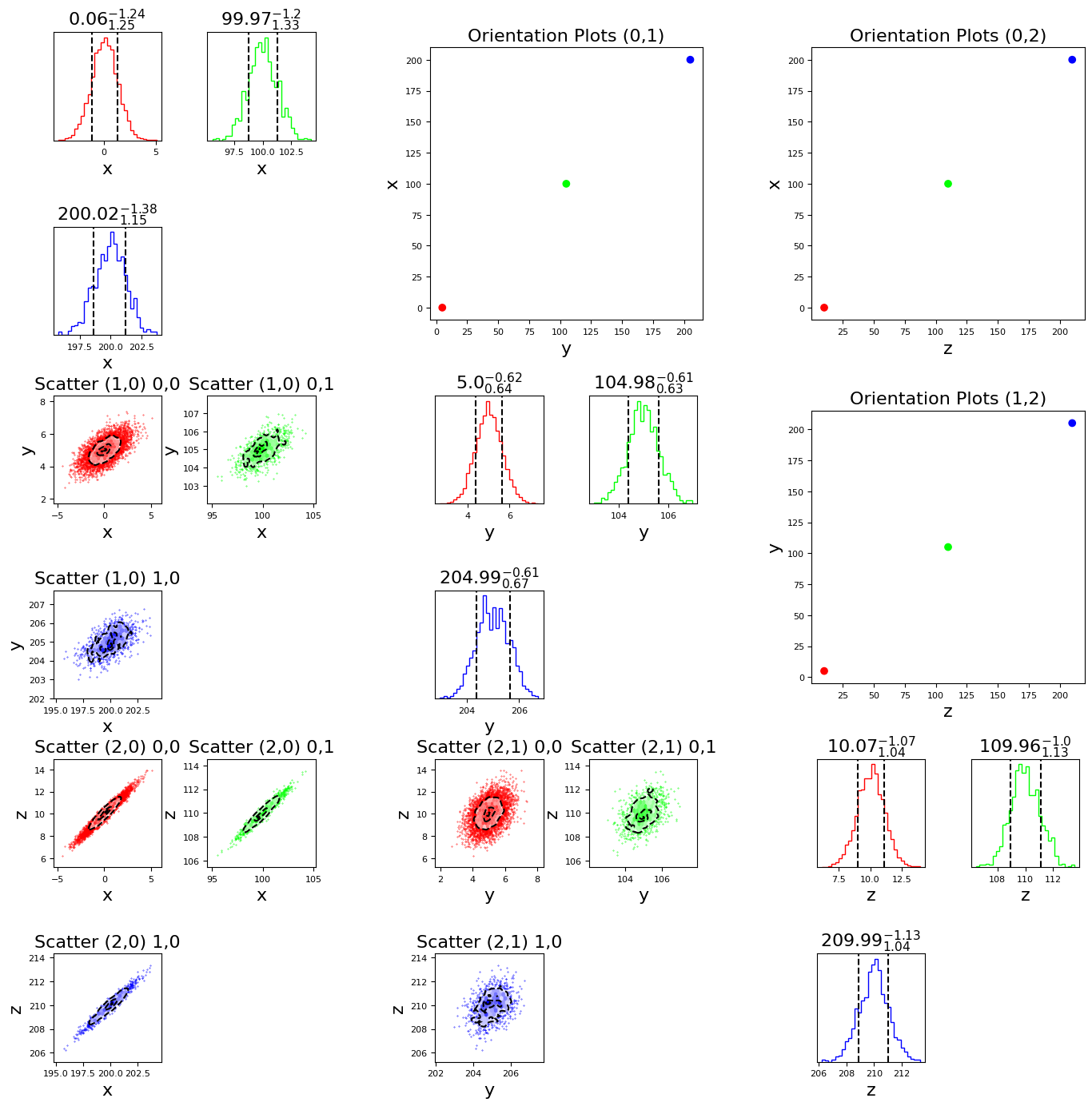
While we choose resonable defaults, some choices of fontsizes can lead to ugly overlap between labels and titles. This can be managed by changing the inner/outer wspace/hspace arguments. Below, we increase the horizontal spacing between our 9 panels and increase the vertical spacing between our 3 subpanels.
[9]:
upper_title_func=lambda i,j: f"Orientation Plots ({i},{j})"
diag_title_func=lambda i,j,ii,jj: f"Histograms ({i},{j}) {ii},{jj}"
lower_title_func=lambda i,j,ii,jj: f"Scatter ({i},{j}) {ii},{jj}"

fig = mcorner(data,labels=['x','y','z'],percentiles=True,upper_title=upper_title_func,lower_title=lower_title_func,diag_title='percentile',
                                  titlesize=16,fontsize=8,labelsize=16,ticksize=8,outer_wspace=0.4,inner_hspace=0.8)
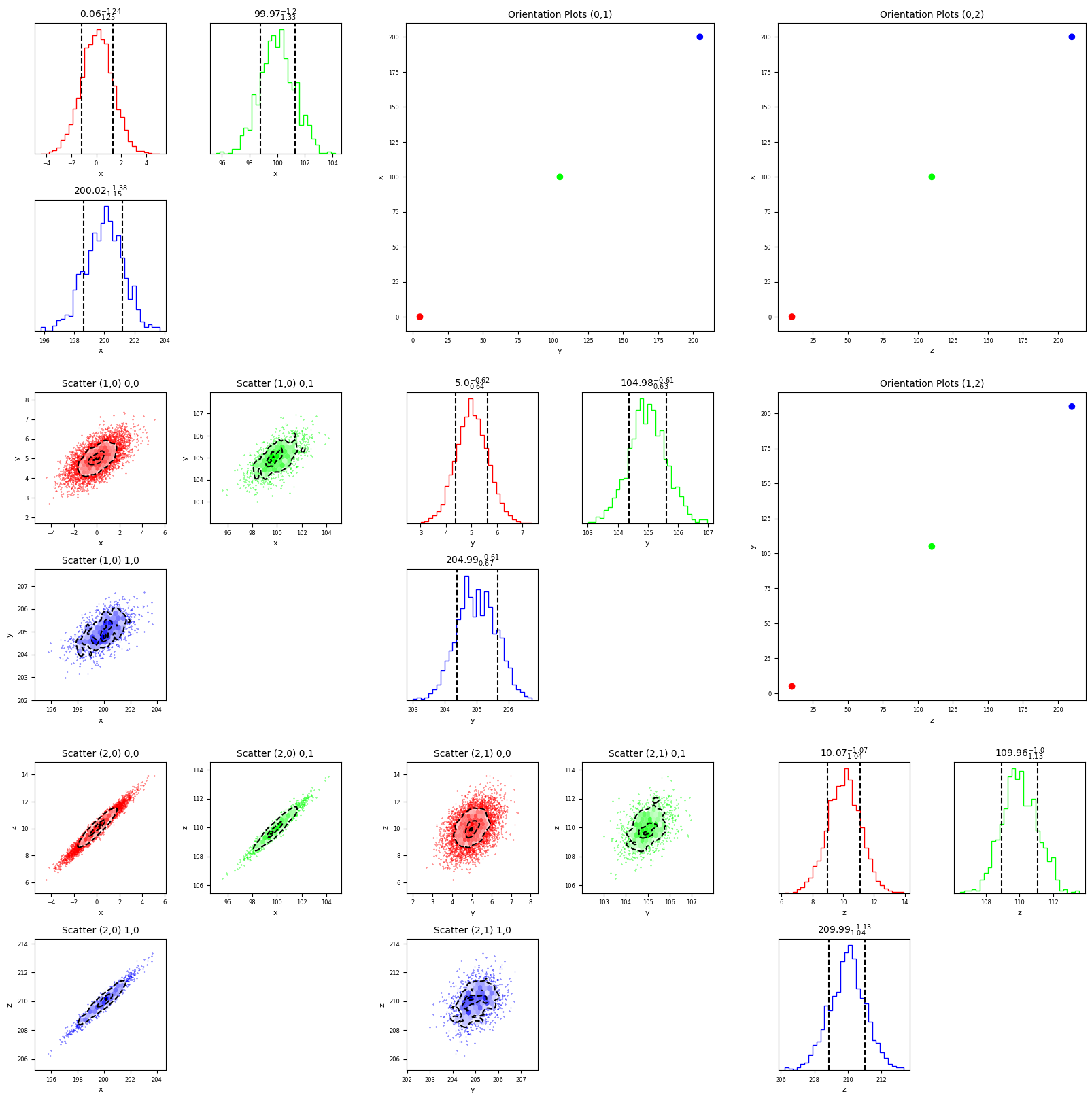
another approach would be to increase the size of the figure, which we can do with the figsize argument
[10]:
fig = mcorner(data,labels=['x','y','z'],percentiles=True,upper_title=upper_title_func,lower_title=lower_title_func,diag_title='percentile',
                                  figsize=20)
[ ]:
[ ]:
[ ]:
[ ]:
[ ]:
[ ]:
[ ]:
[ ]: